Identifying changes in momentum and direction is critical to successful trading. That’s why the Moving Average Convergence/Divergence (MACD) can be such a handy tool…
I use it as part of my mean reversion strategy. That’s where I look for stocks that have overshot in one direction and aim to profit when they reverse back the other way.
Yet even if you trend-trade instead, the MACD can help identify entry and exit points too…
So it’s a versatile tool that can assist a variety of different strategies.
The MACD is often used alongside the Relative Strength Index (RSI) to help confirm any likely moves. So let’s look at some examples today to see how it works in action…
The blue line on the MACD part of the chart below (referred to as the MACD line) plots the difference between 12-day and 26-day exponential moving averages (EMAs).
Unlike a standard moving average, an EMA places greater weight on the most recent data.
The orange line is called the “Signal Line” and is a 9-day EMA of the MACD line. The histogram (black vertical lines) in the middle of the MACD chart represents the difference between these two lines.
When the histogram is tracking back toward zero as the two lines converge, it’s often a precursor to them crossing over. So let’s see how it plays out in the iShares 20 Plus Year Treasury Bond ETF (TLT) – an ETF that invests in high-grade Treasury bonds.
Check out the chart…
iShares 20 Plus Year Treasury Bond ETF (TLT)
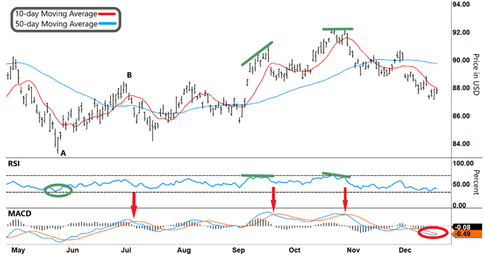
Source: e-Signal
TLT’s reversal higher from “A” coincided with the RSI making a “V” and rallying from oversold territory (green circle). Ordinarily, that might be enough to provide the setup for a long trade.
But the MACD can add another layer of confirmation. You can see where the blue MACD line crosses above the orange Signal line, confirming the up move is in play.
Now look at where TLT locks in a high at “B.” At that time, the RSI didn’t generate a clear signal. But the MACD line crossing back below the Signal line (left red arrow) showed a clear place to exit.
In this example, we’ve used the MACD to capture a trending move (in this case, higher). Now let’s see how you can use the MACD for reversals…
In the middle of the chart, you can see two diverging green lines (between the TLT stock price and the RSI). This pattern often precedes a reversal. But again, you can use the MACD for confirmation.
Take another look:
iShares 20 Plus Year Treasury Bond ETF (TLT)
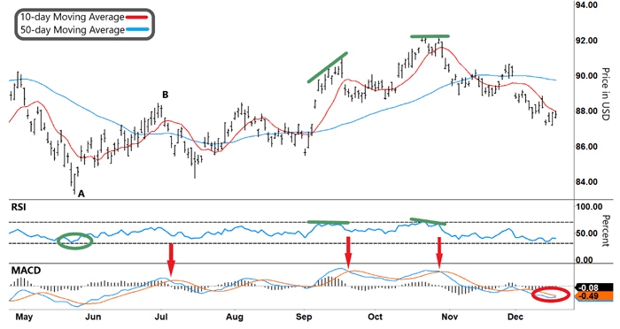
Source: e-Signal
In this example, the MACD line crossing below the Signal line (middle red arrow) could be used as a trigger to enter a short trade. This same pattern and another potential trade repeat in the right diverging pattern (right green lines).
In both cases, you could use the MACD line crossing back above the Signal line as a trigger to exit the short trades.
And that’s not all…
At the right-hand side of the chart, another trade setup could be developing…
The RSI is pushing down near oversold territory (lower gray dashed line), and the TLT stock price is trying to find a base.
In this case, you’d look for the MACD line to cross back above the Signal line (red circle) as extra confirmation of a potential long trade.
As you can see, the MACD is a handy tool…
You can use it for capturing a trend trade or reversals. In either case, it adds an extra layer of confirmation to any trade. That’s why it can be so helpful to use alongside signals like the RSI.
And if you add it to your toolbox, it can help swing more trades in your favor.
Happy Trading,
Larry Benedict
Editor, Trading With Larry Benedict
Reading Trading With Larry Benedict will allow you to take a look into the mind of one of the market’s greatest traders. You’ll be able to recognize and take advantage of trends in the market in no time.
