There are some asset classes that many people simply put in the “too-hard” basket. That’s because they can be choppy and quite difficult to trade…
Take oil, for example. Check out the chart below of the United States Oil Fund (USO) to see what I mean. It’s an ETF that tracks the West Texas Intermediate (WTI) crude oil price.
The commodity bounces around all over the place – and at first glance seems to lack tradeable patterns. This type of action puts people off.
But all those moves and countermoves can be highly profitable – if you know how to trade them.
So today I want to show how you can combine two technical tools to help you navigate (and profit) from these kinds of assets.
Better still, you can apply these tools across many stocks and other markets…
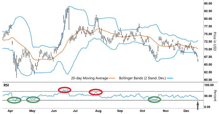
On the upper half of the USO chart below, I’ve added Bollinger Bands. This is a great tool to help determine when a stock is trading at the extremes of its range and could be vulnerable to a reversal.
So it plays right into my mean reversion strategy…
United States Oil Fund (USO)

Source: e-Signal
The upper and lower bands (blue lines) are set at two standard deviations from the mean (orange line). Around 95% of the price action will occur between the blue lines.
The bands stretch wider during periods of higher volatility, and they converge when volatility is falling.
But while Bollinger Bands can help gauge volatility, I use them to find potential changes in direction. When prices start trading near either of the extremes (blue lines), that increases the chances that they will swing back the other way.
Remember, when stocks stretch too far in one direction, they tend to “snap back” like a rubber band. We can profit from anticipating those moves.
You can see numerous examples where the price has tracked along the upper or lower blue line before reversing back toward the mean (orange line). Take another look at the chart:
United States Oil Fund (USO)
Source: e-Signal
However, we can’t just blindly short or buy a stock just because it’s tracking along a blue line. As you can see, sometimes a stock can trade at extremes for a while. We need more information to know if a turnaround is imminent.
And that’s where the Relative Strength Index (RSI) fits into the picture…
In the RSI section of the chart, I’ve placed three green circles. That’s where the RSI has rallied from oversold territory (lower gray dashed line). You’ll see that USO simultaneously rallied off the lower blue line at those moments.
You can see another similar setup developing at the arrow on the right side of the chart.
Similarly, when the RSI reversed from overbought territory (red circles), that corresponded with USO retracing from the upper blue line. So the trick is to use both indicators together…
By combining Bollinger Bands and the RSI, we’ve greatly increased our chances of catching a reversal and setting up a profitable trade.
Ideally, we look for the RSI to reverse from overbought (70% or higher) or oversold territory (30% or lower). Plus, we try to catch a swing in momentum when the stock is trading at either the upper or lower Bollinger Band – such as the reversal lower in September.
Bollinger Bands help identify when a stock could be vulnerable to a reversal (and potential trade). But we need to cross-reference it against the RSI to help pinpoint when we’re about to see a potential change in direction.
By combining these technical indicators, you’ll greatly improve your chance of banking profits – even in the most choppy and challenging markets.
Happy Trading,
Larry Benedict
Editor, Trading With Larry Benedict
Reading Trading With Larry Benedict will allow you to take a look into the mind of one of the market’s greatest traders. You’ll be able to recognize and take advantage of trends in the market in no time.
