Earlier this week, I explained why I like trading the S&P 500. Today I want to talk about my other favorite market to trade – oil.
Every morning, I look at two charts: the S&P 500 and oil. At this point, it’s a habit.
Oil is a crucial part of the economy… and thereby the markets. It’s used to provide heat, energy, and even in the production of some materials.
It’s the biggest part of all the major commodity indexes. That’s why I make sure to watch it every day.
An overly high oil price can wreak havoc on both the economy and the markets. The oil embargo of the early 1970’s always comes to mind.
To keep tabs on oil, I usually look at the Energy Select Sector SPDR Fund ETF (XLE). XLE represents energy behemoths like Exxon Mobil (XOM) and Chevron (CVX). And these stocks generally track the price of oil.
The sector has performed well since late last year.
Check out XLE’s weekly price action in the chart below…
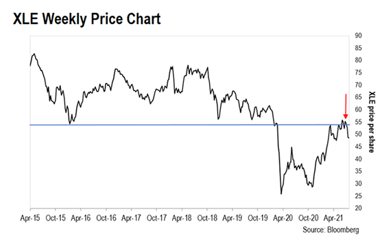
The horizontal blue line on the chart represents the $56 price level going back to 2016.
Price levels are something I watch closely. They show when buyers and sellers are most likely to enter a market.
From 2016 to 2020, whenever the price of XLE fell to the blue line, buyers came into the market and pushed the stock higher. So, this became a support level for the stock.
That held true right up until January of last year.
With many stuck at home, and the economy on the ropes due to COVID-19, demand for oil collapsed. It took until last November for XLE to finally bottom out. The lack of demand actually caused oil to trade negative at the height of the pandemic. Oil’s rebound from there meant that demand was growing again… at the time, it was a great indicator of how rising oil prices can predict a growing economy.
As you can see, XLE rallied from there… right up to where it bumped into that same blue line (the red arrow). The topping out of XLE coincided with oil trading at $75 a barrel.
You see how important these key levels are? Once a stock moves below a support level, it often then becomes a resistance level. And resistance levels often cause investors to sell.
That’s what happened throughout this past June. Each time XLE tried to break above the blue line, another wave of sellers sent the stock lower.
In a little over a month since then, XLE has fallen around 15%. This tells us that this is a strong resistance level.
As traders, we like it when we see this kind of price action on the charts. It helps us to build a picture on where the market is going next. If the resistance level remains strong, it should develop a pattern we can trade.
It may be too soon to think about trading XLE, but we’ll continue to watch it, and let you know when we see a stronger signal to consider a trade.
Regards,
Larry Benedict
Editor, Trading With Larry Benedict
P.S. We’re excited to hear what you think of your new eletter, Trading With Larry Benedict. Let us know at feedback@opportunistictrader.com.
Reading Trading With Larry Benedict will allow you to take a look into the mind of one of the market’s greatest traders. You’ll be able to recognize and take advantage of trends in the market in no time.
