|
Larry’s note: Welcome to Trading with Larry Benedict, the brand new free daily eletter, designed and written to help you make sense of today’s markets. I’m glad you can join us. My name is Larry Benedict. I’ve been trading the markets for over 30 years. I got my start in 1984, working in the Chicago Board Options Exchange. From there, I moved on to manage my own $800 million hedge fund, where I had 20 profitable years in a row. But these days, rather than just trading for billionaires, I spend a large part of my time helping regular investors make money from the markets. My goal with these essays is to give you insight on the most interesting areas of the market for traders right now. Let’s get right into it… |
Over the past couple of weeks, we’ve applied my mean reversion strategy across different sectors of the market to find profitable trade setups.
Today, though, I want to dive a little deeper.
So, let’s look at one of the technical indicators that I use alongside mean reversion.
It’s called the Relative Strength Indicator (RSI).
The goal of the RSI is to gauge momentum. Put simply, momentum lets me see whether a stock is overbought or oversold.
If buyers push a stock too hard, the resulting rally will inevitably bring in sellers. That’s why you see pullbacks even in the strongest rallies – it’s simply too tempting for some investors not to sell at highs.
It’s a similar story with an oversold market. If sellers panic and dump their stock, the price dip will likely bring in buyers looking for a bargain. In the short term, this can drive a stock price higher.
When either happens – causing a change in momentum – the RSI can provide clues when to enter or exit a trade.
To see what I mean, let’s go back to a similar chart we looked at just over a week ago. It’s a chart of the SPDR Gold Shares ETF (GLD) – which aims to match the gold price.
SPDR Gold Shares ETF (GLD) – Daily Chart
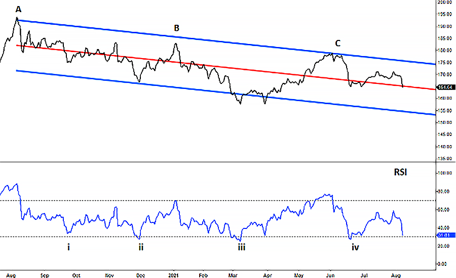
Source: eSignal
On the chart, you’ll see the familiar red and blue lines we’ve looked at before. The red line represents the trend line, with the upper and lower blue lines capturing the majority (95%) of the price action.
You’ll also notice that I’ve added the RSI indicator towards the bottom.
When the RSI trades above the upper horizontal dotted line (the 70 level), it indicates the stock is overbought. And, when it trades below the lower horizontal dotted line (the 30 level), it indicates the stock is oversold.
On the price chart, I have placed an A, B, and C where there have been major price reversals and GLD moved lower. Now match those points against the RSI below it.
As you can see, these major reversals have occurred when the RSI was showing GLD to be overbought. That is, on or above the upper dotted line on the RSI.
You’ll also notice that I’ve placed a i, ii, iii, and iv on the RSI where it shows GLD to be oversold. Now compare that to the subsequent action on the price chart above.
The GLD stock price rallied just as the RSI indicated it was oversold.
You can see just how closely the RSI and stock price follow each other. The more you look, the more of these match ups you will see.
If the RSI is indicating an overbought or oversold position, there’s a strong possibility that a move has lost momentum. And that means a stock could be about to change direction.
Remember, we’re not hoping for a once in a lifetime move with our strategy. Instead, we’re trying to profit from many smaller moves and put a “p” on the page.
Right now, you’ll notice that the RSI is heading back down to an oversold position. That means a potential long trade in GLD could soon be shaping up.
Trading is a game of probabilities. But, by using the RSI as a key alongside my mean reversion strategy, you can put the odds (and profits) firmly in your favor.
Regards,
Larry Benedict
Editor, Trading With Larry Benedict
P.S. We’re excited to hear what you think of your new eletter, Trading With Larry Benedict. Let us know at feedback@opportunistictrader.com.
Reading Trading With Larry Benedict will allow you to take a look into the mind of one of the market’s greatest traders. You’ll be able to recognize and take advantage of trends in the market in no time.
